More Steps
Posted: 2026-07-21 | Last Updated: 2026-07-21
1394 words | 7 minute read
Hello again! It's been a couple weeks since the last post. During that time, I've managed to make more progress in getting this blog to a proper presentable state.
What's new?
In actuality, I haven't actually changed all that much code. It just turns out that through the magic of HTML and CSS, just a few lines of code has quite the amount of visual impact.
For example, this used to be the homepage:
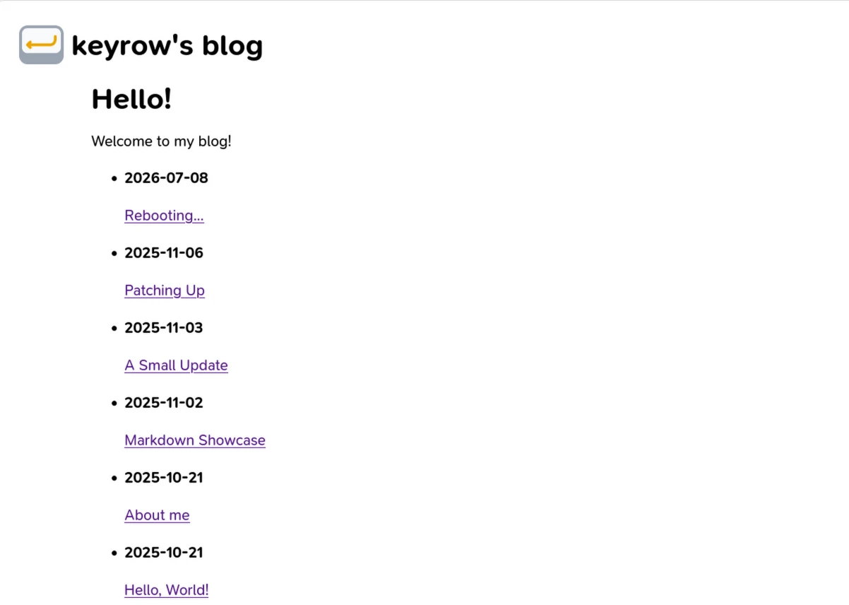
And now, it's this:
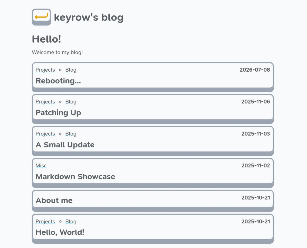
Finally, something presentable!
About the "Keys"
After designing the logo last time, I had a small question:
What if I make the logo key an actual key that reacts to the user?
Turns out, with a little bit of CSS animation, this was absolutely possible. I liked it so much that I decided to just make the whole website revolve around keyboard keys. In case you haven't figured it out yet, I love keyboards!
On the other hand, I didn't want my whole site to be basically chock full of SVGs, which really make my code way harder to read. So, I just scoured the web to learn how other people designed buttons. Eventually, I stumbled upon this W3Schools article on animated buttons, in which I found something peculiar...
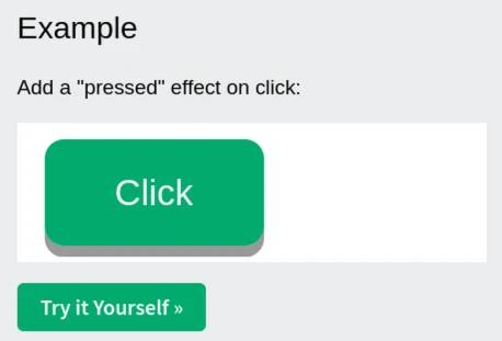
Is that a KEY??
And not only that, but it took like just 20 lines of code to achieve that effect! So I just implemented something similar as a generic CSS class on my site so I can arbitrarily keycap-ify any element I want :D
Sections and Breadcrumbs
If you tried using the site as the last blog post was posted, you may have noticed that all the blog posts were clustered together on the homepage with no organization. Figuring out which posts were related to each other would be pretty tricky. That said, if you were keen-eyed, you may have noticed that the slug of each webpage had some subsections... subsections that were not at all reflected in the user interface.
Well, that ends today! I finally implemented section pages, so you can figure out the groups of posts that are related to each other. Additionally, to let you find these section pages more easily, I have also added breadcrumbs on each "key" to let you figure out which section an arbitrary post belongs to (and so you can find other relevant posts!).
So with that done, it should leave me with a nice, perfectly-functional homepage, right...? Well...
Breadcrumbs Don't Like Being on Keys
As it turns out, HTML has a thing where you can't nest interactive elements inside one another. For example:
<a href="/a">
  <a href="/b"> <!-- NOT ALLOWED! -->
    nested link
  </a>
  link
</a>
This really bugged me, since for the homepage keys, I wanted it such that if you clicked the breadcrumbs, it would send you to the section page. However, if you clicked anywhere else on the key, it would send you to the blog post. After all, a keypress is a keypress no matter where you press it (with the exception of the breadcrumbs).
Eventually, I figured out a solution.
If I can't nest interactive elements, that doesn't mean I can't stack them!
So, as long as I could figure out the CSS, this is pretty much the HTML's structure:
<div>
  <div class="column">
    {% include "partials/breadcrumbs" %}
    <h2>Title</h2>
  </div>
  <a class="clickarea"></a> <!-- allowed! -->
</div>
where the anchor with the clickarea class is pretty much just a large, clickable box with nothing in it. After searching around a bit, I found this post on CSS Tricks (amazing resource btw) which helped me figure out how to stack stuff as I liked.
However, there's a new issue. I need the title and the breadcrumbs to be vertically aligned like a column, but at the same time, the title needs to be behind the clickarea while the breadcrumbs have to be above the clickarea (otherwise clicking the breadcrumbs would just register as a click of the key).
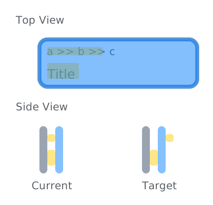
Well, the creators of CSS appear to be ten steps aheaad of me, because they made a CSS property just for this: z-index! I just needed to set the z-index of the breadcrumbs is above that of the clickarea, and that did the trick.
(Turns out I actually didn't need to even give the clickarea a z-index since an element with a defined z-index above zero will always be placed above an element with z-index unset(i.e., z-index: auto). So just setting z-index for the breadcrumbs was all that was required. A one-liner! How nice.)
Bonus: Anchors without text? Preposterous.
See that trick I used earlier with the clickarea? Turns out that doesn't really fly with web accessibility guidelines. Why? Well, because it's just a big clickable box which doesn't really say anything about what it does. Sure, if you've got decent vision, you can visually see the title hiding under the transparent clickarea, but for those who aren't so fortunate and rely on accessibility tools like screen readers, it's a bit of a mystery button.
Given that I really want to meet accessibility standards, this put me in a bit of a bind. On the one hand, if I put text into the link, then it basically places some random floating text on the key which is visually not great. On the other hand, if I either leave out the text or hide the text, then it's not great for accessibility.
As always, the webdev creators have all their bases covered. Introducing ARIA (Accessible Rich Internet Applications) roles! By adding a neat attribute to the clickarea, namely aria-label, I can make sure the clickareas are recognized properly no matter what.
Metadata Shenanigans
Another thing I worked on was actually header metadata. This actually happened right as I was doing my obligatory Mastodon post for #100DaysToOffload (because making a social media post for each blog post is required), where after making the post, I was wondering why my blog link looked super lame compared to all the other links on Mastodon. The reason? My blog's header had practically nothing in it.
Just go to any popular website or established blog and inspect the HTML header. For pretty much any site out there, it's absolutely loaded with metadata. For example, you can include an image for the page, a description, a title, a summary, etc. Among these metadata tags, there are quite a few starting with og:. This stands for "Open Graph", refering to the Open Graph protocol. And for applications/sites where pasting a link also generates a neat embed (like Mastodon), Open Graph metadata in the header is used to generate the embed.
In the end, I ended up just adding just a couple meta tags for Mastodon to generate a nice embed for my blog links, namely the following:
og:descriptionog:imageog:titledescription
And since this is for Mastodon, I also added a few Mastodon-specific tags by following the tricks mentioned in this article. I would like to quickly note that the article is missing one crucial step for the author link on Mastodon previews to work:
- You also need to go to the Verification page in the settings (can also be found in Settings -> Public profile -> Verification), and then add your link in the "Author attribution" section.
This whole thing caught me by surprise, and it's only now that I realize how much stuff is actually in the header. Like seriously, check out the header partial for the apollo Zola theme. That's a lot of stuff!
Wrapping Up
Anyhow, this pretty much gets my blog to the point that I'm fairly comfortable presenting to others (farewell, purple links!). Of course, that doesn't mean I'm done with theming the blog, but it sure means that I can start prioritizing writing content about stuff other than the blog... on the blog.
Also, out of curiousity, I ran the homepage of the blog through Pagespeed to see how it performs, and...
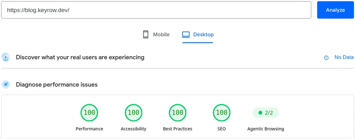
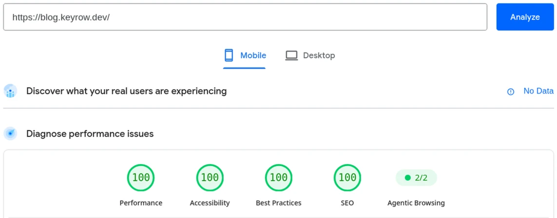
100s across the board! Woohoo!
Anyway, until next time! Bye~